There are a lot of SEO mark-ups out there and any that you are missing out on can potentially give the competition an edge over your site’s rankings. Today we are going to cover the importance and difference between an image alt and title tag and how they relate to SEO.
Let’s start off with the image alt tag.
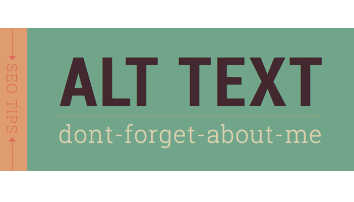
Image Alt Tags
The image alt tag is a useful tool to give information about an image in case it doesn’t load properly, is blocked from loading, or in case it is on a page being visited by someone with visual disabilities. It should always describe the image. Since Google places importance for SEO on the image alt tag it is important to try to also include keyword information if applicable. Remember, keyword stuffing is keyword stuffing, even on image alt tags so don’t force keywords in there unless they serve a purpose.
Let’s take the image below for example: That good looking fella happens to be me. A good image alt tag might be “Capisco staff pic of Christopher Long.” Now, since we are an SEO company, I might try to include some of that information to make the alt tag a bit more SEO friendly and go with: SEO manager Christopher Long. Not too shabby. Ok, so we have alt tags covered, lets move onto image title tags.
Image Title Tags
Text for an image title tags often will pop-up on a mouse hover-over. For that reason your title tag should aim to identify an image and give more information or context about it. Since it is not as important of an SEO mark-up, I wouldn’t place as much emphasis on trying to fit in keywords.
Lets take the above picture again as an example. Here I would identify the image and try to add more context to it. For example: Capisco staff pic of Christopher Long taken August 2015.
The Main Takeaways
The main takeaways are this:
(1) Alt tags are important for SEO (2) Alt tags should focus on describing the image and should include keywords if possible and natural (3) Do not keyword stuff your alt tags (4) Image title tags are not as important for SEO. (5) Title tags should identify the image and provide context or more information about the image that the page visitor might be interested in. We hope that you found this information to be useful. If you have any questions, you can email them toteam@capiscomarketing.com and we will be happy to assist. Thanks for reading!
When starting a blog, the most beneficial way to begin is by creating your own domain through a blogging or website platform such as WordPress instead of setting up under a subdomain / directory of another site.
By creating a website or blog on your own domain you are ensuring that your content will always be under your control. Although big name blogging sites will try to persuade you to contribute your content to their site with lures of simplicity and notoriety, don’t be duped. On the Web, content is king and it is looked at as a valued and prized commodity. Don’t give your thoughts, talents, art or expertise away freely. Benefit from the fruits of your labor.
It may seem easier to set up your blog on a major blogging site, but it is not more advantageous. Firstly, you lose a great deal of control, ranging from format and length limitations, to censorship, privacy or even the authorship rights to the very content you create.
If you already have your own website, you are in luck. You can easily add a blog section to your site. Blogs consist of fresh and unique ideas, and once you connect one to your site and add the icons to encourage your audience to share your posts on social networks, you will get more traffic to your page. An increase in traffic will create more hits on your site and thus improve your web positioning. it is always important to remember that the more your content is shared, the more publicity is created for your business, so always update your information and participate in activities through social media that will enhance your web presence.
The days of sitting at one’s desktop computer to surf the web are long gone. With the advent of smartphones and tablets, people are accessing information in the palms of their hands at an alarming rate. So what does this mean for smart businesses? It means they need to be prepared to share their information on the mobile web. This brings up another question: is it better to have a native app or a mobile-optimized website for your business?
Native Apps are faster, more interactive and can access your mobile device features. They’re good for regular usage/personalization, with no connection required. Native apps are built using programming language specific to the platform of a particular mobile device, so one native app can’t run on different mobile platforms and every platform needs to have its own native app. Most of the games you play on your smartphone are native apps.
Mobile sites are easier to navigate, instantly available, easy and inexpensive to build and update, compatible across all devices, can be found more easily, and have broader reach. If a mobile site is developed for one’s business, a responsive design is the best way to go. A responsive design adjusts to the device it is being viewed on, whether it’s a PC, tablet or smartphone.
Mobile Web Apps can function across all platforms from any mobile device. They can only partially use features of a mobile phone, i.e., the GPS but not the camera. They are not available in an app store, so they don’t require any approval process. Web apps can be used without having to be downloaded and installed onto a mobile device. An example of a web app is Google Calendar.
Mobile Websites
1. Accessed by smartphone and tablets through the web browser
2. Static, navigational user interface
3. Requires connection
4. Somewhat limited features
5. Speed – Fast
6. Development cost – Reasonable
7. App store – Not necessary
8. Approval process – none
Native App
1. Accessed after being installed from app store onto mobile device
2. Specifically designed to work only on the operating system of the device downloading the app
3. Interactive user interface
4. Available offline
5. Can access phone features like GPS, camera, etc.
6. Speed – Very fast
7. Development cost – Expensive
8. App store – Available
9. Approval process – sometimes mandatory
10. Require periodic updates in order to continue working properly
Native apps offer a superior experience in the context of today’s technology. They leverage components of their native operating system so they look and feel more polished, run faster, and are thoroughly integrated with the mobile device. Native apps are only as good as the present technology so as technology continues to evolve, native apps are likely to become obsolete.
Mobile Web App
1. App store or marketplace not needed to download and install web app
2. Specifically designed to work only on the device’s OS
3. Interactive user interface
4. Accessed through the mobile device’s web browser
5. Cannot make use of all phone features like camera, stored photos, etc.
6. Speed – fast
7. Development cost – Reasonable
8. Not available for purchase from app store; as such, it can be harder for users to find your app
9. Approval process – none
10. No need for updates: the most current version is loaded each time a web app is opened.
A web app is typically coded in HTML combined with JavaScript. While fundamental differences will likely remain between a native and web app for some time, the user experiences provided by both interfaces are increasingly indistinct, as most native apps utilize real-time web connectivity and web apps provide offline modes that can be accessed without network connectivity. As a result, some of these apps are now referred to as hybrid apps.
It comes down to the goal of your site or business and budget. If your objective is to offer mobile-friendly content, reach a broader audience, offer immediate access to your business, the ability to make frequent updates, and you have a limited budget, then a mobile site is probably best for you. If you want to offer an interactive experience to your user, add personalization to your service/business, allow users to access their mobile device functions (GPS, camera, contacts, etc), and give the user access to your site without being online, then a native app might be your solution. Ultimately, mobile users want ease of access, a fast connection, and a smooth look and feel. Looking ahead to trends in the coming year, smart businesses are likely to embrace the strengths and differences of all development options, even including the use of web-native hybrid apps in addition to mobile websites. This varied approach challenges us to stay on top of tumultuous trends, new technology and anticipate consumer demand.
On this, the last day of the year, it’s time to take a second and reflect on a huge year in the Web Development realm. Phrases like ‘Responsive Design’ and ‘Content Strategy’ entered our vocabulary. Words like ‘Flash’ and ‘Splash Page’ are exiting or, in some circles, are considered cuss words. Here are my top 10 favorite things that happened in 2012:
1. Responsive Design: Responsive Design is a new paradigm in Web design that, through coding objects to appear at relative distances from other objects, websites are rendered extremely amicable towards the various sizes of smart devices. Responsive web design determines the resolution of the device that’s accessing the site. It is then sizes accordingly to fit the screen. Though it all started late last year, it is rapidly becoming a Web standard…designers out there best pay heed. Bridging the gap between mobile sites, WAPs & corporate websites, businesses can now service all these needs with one malleable core website. Everyone is talking about Responsive Design, don’t be late to the table – Ethan Marcotte is a damn genius.
2. Grid Systems: A fundamental tool of efficiency, grid systems standardizes the various size metrics that a designer and developer will work within to fabricate a website. It allows flexibility and encourages correlation between web page elements, eases the integration of photos and text, and reduces significant coding errors. Saving time in communication and redesign specs, grid systems are an excellent complement to Responsive Design. The two I’ve been tinkering with are Twitter Bootstrap coded with Less and Foundation with Sass. At this moment, I’m leaning more towards Sass. So would have to pick Foundation.
3. Parallax: Parallax has been used in the video game world for quite some time but is just now spilling over into the Web development world. Think back to the old scrolling Mario games of your ill-spent youth and you’ll have an idea of what Parallax is. Although the Parallax fuse has only recently been lit in the Web dev world, it is spreading like wildfire. By adding a level of perspective and dimension to a website, intriguing effects engage site visitors and encourage them to longer duration stays. I have a feeling 2013 is going to push the envelope on what a website should look like…we are going to be seeing some sick sites.
4. Real Rockstars: Just like having your favorite bands, we all have our rockstar developers who we love to stalk. Paul Irish and Chris Coyier are my 2 top faves. You might wanna think aboutstalkingthemyourself, but get in line. With these guys leading with new ideas that push the possibilities and sharing it all with the rest of us…if you think about it, our dev community is pretty phenomenal. Thanks, guys!
5. GitHub: GitHub is a code sharing and publishing service as well as a social networking site for programmers. It manages and stores revisions of projects. Version Control never felt so good.
6. Circles in design: Lots of circles going on in Web design these days. CSS3 makes it easy to trick out a site and make entrancing, eye-catching round frames. I see a lot of agency sites exploiting this trend. Even Basecamp is doing the circle dance.
7. Open Sans: A huge chunk of my clients mid-year started using Open Sans. It’s a Google Webfont and probably one of the more decent ones they are rolling. Open Sans is a clean and modern sans-serif typeface designed by Steve Matteson and commissioned by Google. It is especially designed for legibility across print, web, and mobile interfaces. It also comes default in the Foundation WP theme.
8. WordPress 3.5: The WP community is so impressive. I’ve never seen so much pride taken in a product. The new 3.5 has a much improved media uploader and the default theme that is responsive. I need an “I Heart WP” shirt, stat.
10. Online School: Lynda.com has been around for a long time now and finally we are starting to see some new players in the online training realm. CodeSchool.com is my new fave. You actually get to apply what you learn and take coding challenges. Treehouse.com is another good go-to. Also check out generalassemb.ly.
Lots of killer ideas hit in 2012. In 2013, I see a lot of refinement on those ideas and the inevitable shift toward a more tailored device driven user experience (my grandma has an iPad for goodness sakes). In short, 2013 is going to be frickin awesome.


 Website Design and Development Trends